One of my personal core values is authenticity. There’s quite a few interpretations out there of what it means to be authentic, so to be clear, I define authenticity as the absence of pretense and deceit. I don’t like pretending to be somebody I’m not, or deceiving people into buying stuff they don’t need. I want to be able to honestly own up to what I do and what I create, as something truly my own.
This can be challenging in working life, where we usually ‘play a role’ in an organisation with business objectives that don’t always align with our own values. That’s life, and we need to learn to live with it, or try to find an employer with less objectionable business objectives. But when I quit employed work to pursue my artistic interests (ie when I reFocused), I thought I would have to make fewer of those compromises. After all, I’m my own boss now, so I should have no problem aligning my values, right? Well, as it turns out, it’s more complicated than that. Let me illustrate this with the story behind one of my Dotgrid patterns.
The Dotgrid Series is authentically ‘me’
In many ways, the ‘rogue polka dot’ patterns I have developed over the last few months are very characteristic of me and my approach to design. They play with our visual perception, making us see forms that are not actually there, just by tweaking the size of individual dots in an otherwise meaningless regular grid of dots. They play with overall scale, too, looking very different from a distance and close up. And their grids are slanted in all sorts of directions other than horizontal and vertical, thus obscuring – to some extent – the rectangular repeat of the seamless pattern.
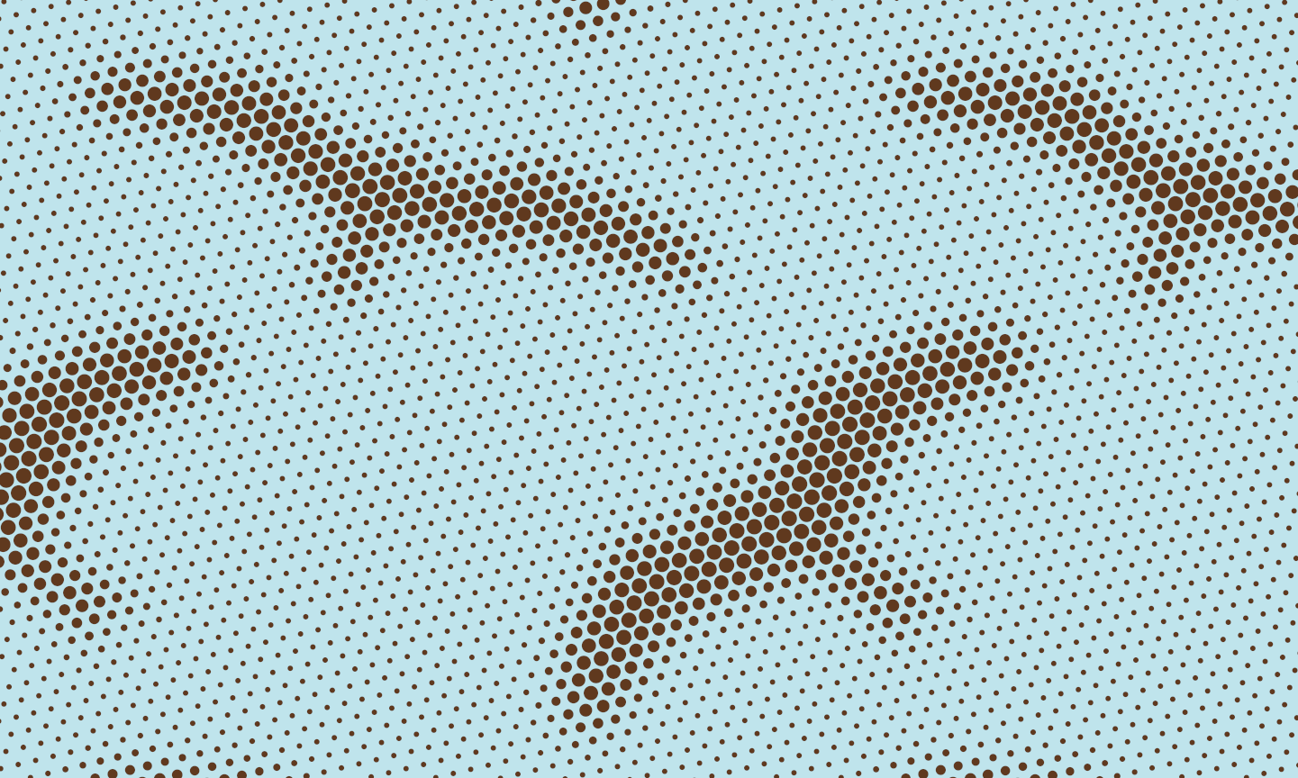
This theme of emergent patterns, illusions and varying perspectives is rooted in my neuroscience background and has pervaded all my careers in one form or another. So it is very ‘me’. And the Dotgrids, specifically, have also appeared in my past creative output, like in this animated Chinese New Year greeting card I designed for the Year of the Ox.
So, as an artist, I am very pleased with my Dotgrid patterns. However, there is a snag when it comes to presenting these patterns on platforms like Spoonflower.
Sacrificing a concept for promotion
Spoonflower – the first print-on-demand platform I engaged with – hosts a weekly design challenge, and I have participated in these quite regularly. They are judged by the public (ie mostly the Spoonflower artists who entered themselves, I suspect), who get to scroll through thousands of entries each week, voting for their favourites.
When I entered the ‘Ospreys in a Dotty Sky’ pattern above in the ‘Birds of Prey Wallpaper’ challenge some time back, I knew it would not do well, though. The problem was that each entry is presented as a single image, in this case a wallpaper mockup with quite a low resolution. So my ospreys just came across as slightly blurry blotches, and the whole concept of scale and varying perspectives was completely lost, inaccessible to the voters.
Then came the ‘Whimsigothic Wallpaper’ Design Challenge, and I felt I had to give my Dotgrids another go, since the juxtaposition of whimsy and goth seemed to lend itself well to my dual perspectives concept – imagine a wallpaper that looks gothic from across the room and whimsical when you sit right next to it. I also had designed a skulls pattern some time earlier, which I thought could address the gothic theme quite well.


For the whimsy, I added a loose web of delicate, fine twigs and leaves on top of the large-scale skulls background. These would be barely noticeable from a distance, but would attract the viewer’s focus up close, helping to perceptually break up the skulls in the background into their individual dots.
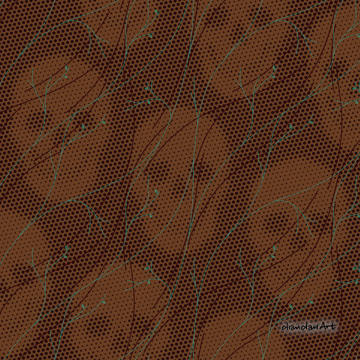

Of course, this delicate concept bit the dust again when the pattern was displayed in Spoonflower’s wallpaper mockup. In order to try and get the idea across to the voting public, I was forced to butcher my design by making the green lines and leaves a lot bolder. Which of course means that on the real wallpaper, should anyone ever want to install that, this no longer so whimsical web would also be seen from across the room, negating the whole idea behind the design…
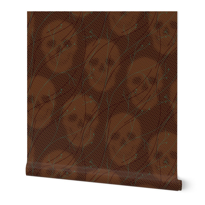

Challenging our authenticity
Unfortunately, this is just one example of an artistic idea having to be compromised to make the final design more easily consumed by an online audience. You might argue that this is actually the nature of design; we design for the audience and within the constraints of the design’s application, and not for ourselves and our artistic expression. But in this case, the design’s intended application – the wallpaper – would actually have been better with the original design, but that had to be corrupted for the purpose of promoting it, of having it noticed.
As a designer, how do you balance your artistic integrity with the demands of commercial promotion?
This dilemma is of course even more pronounced when we try to promote our designs on social media. We can all too easily fall into the trap of making design decisions based on how well the design might do on Instagram rather than what the final product would look like, should anyone actually be enticed to click through and buy the design.
And that’s where my authenticity challenge comes in again. Marketing my designs by deliberately presenting them as something they are not (or worse, designing them as click-bait in the first place) is decidedly ‘not me’. But I noticed that, once I tried to get my designs noticed online, I started sliding back into that rut I thought I’d jumped out of when I left the corporate world.
So, I need to keep reminding myself to stay true to myself and my ideas. Of course, if I want to see my patterns out in the world, I still need to retain a presence on my digital platforms. But I need to find a way to present these designs as what they are, even if their concept does not lend itself to online promotion. I am sure there are people out there who appreciate this kind of design – I just need to help them find my work…
drandanArt Studio Update
Speaking of digital platforms… I have recently launched the drandanArt Redbubble Shop!

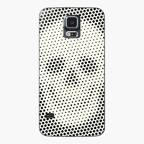
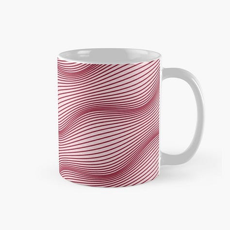
Redbubble offers a different range of products than Spoonflower. It also allows artists to adapt their designs specifically for each product, opening up a whole new world of possibilities in my mind… ; ) So far, I have only added 15 designs to my shop, but there are plenty more to come, so I think it’s worth checking out.
There is a whole collection of drandanArt Dotgrid patterns on Spoonflower.
You can also find out more about the Dotgrid Series on the drandanArt Website.
And of course, you can subscribe to reFocused for free, I you haven’t already. I’d love to welcome you to the club!


